

TerriSea
-
Posts
579 -
Joined
Content Type
Forums
Store
Blogs
Downloads
Events
Gallery
Posts posted by TerriSea
-
-
Hi gals,
back again with more questions :)
Fire or not Fire???
http://www.jcrew.com/womens_category/dresses/weddingsparties/PRDOVR~96454/99101673286/ENE~1+2+3+22+4294967294+20~~~20+17+4294967097+72+4294966675~90~~~~~~~/96454.jsp YES: Clover, Deep Rose and Blue Sapphire! :D
http://www.jcrew.com/womens_category/dresses/weddingsparties/PRDOVR~98999/99101673340/ENE~1+2+3+22+4294967294+20~~~20+17+4294967097+72+4294966675~90~~~~~~~/98999.jsp YES: Clover, Deep Rose and Blue Sapphire! And MAYBE on the Vintage Blue! I think the Vintage Blue is an Earth Blue....
http://www.jcrew.com/womens_special_sizes/size16/dresses/PRDOVR~19849/99102017323/ENE~1+2+3+22+4294967294+20~~~20+17+4294967097+72+4294966675~90~~~~~~~/19849.jsp YES: Stem and Deep Rose. Stem is a little bit too muted for Fire, but it is so close that I am going to say yes! ;)
http://www.jcrew.com/womens_category/dresses/weddingsparties/PRDOVR~17404/99102081451/ENE~1+2+3+22+4294967294+20~~~20+17+4294967097+72+4294966675~90~~~~~~~/17404.jsp YES: Clover, Light Blade, Matisse Blue and Bright Coral. Maybe YES: Chocolate. It's a little dark, but very nice and warm. I say Yes, after all.
http://www.jcrew.com/womens_category/dresses/weddingsparties/PRDOVR~17420/99101796880/ENE~1+2+3+22+4294967294+20~~~20+17+4294967097+72+4294966683~90~~~~~~~/17420.jsp YES: Chocolate and Tropical Aqua
http://www.jcrew.com/womens_feature/catalogjcrewcomexclusives/dresses/PRDOVR~24356/99101955727/ENE~1+2+3+22+4294967294+20~~~20+17+4294967097+72+4294966683~90~~~~~~~/24356.jsp YES. Oui. Si. Jah!! ...wink...
http://www.jcrew.com/womens_special_sizes/size16/dresses/PRDOVR~19849/99101913969/ENE~1+2+3+22+4294967294+20~~~20+17+4294967097+72+4294966683~90~~~~~~~/19849.jsp YES: Deep Rose and Stem. See how the Warm Fig is too grayed to be a Fire brown?
http://www.jcrew.com/womens_special_sizes/size16/dresses/PRDOVR~22747/99101919320/ENE~1+2+3+22+4294967294+20~~~20+17+4294967097+72+4294966685~90~~~~~~~/22747.jsp YES: Chocolate and Bright Coral. To me, the Clover color looks too cool in this style, but the previous clover styles were right on!
I do have more I want to say, but I have to run : at work and gotta meet others for a bit!! Take care,
And
I LOVE those dresses; I want some!! :D
-
Doesn't look Fire to me. Sorry. :)
This looks Fire:
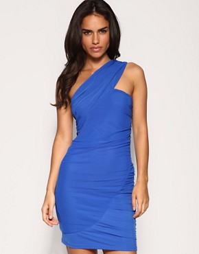
Source: us dot Asos dot com
:)
-
Anita,
Awesome job on losing weight! I, unfortunately, have been "finding" it as I go, proving that what comes around goes around.....:p Thanks for your opinion on colors, too. You really have a gift of clarity. :)
Kim,
Pants are sooooo hard! In order to have a great pair of pants, they have to fit just right, be cut as if for you alone, and also be a great and versatile color too!! I used to like Ann Taylor and Express or Banana Republic, but not so much lately. For denim I like Old Navy and Coldwater Creek. I also have some Tahari dress pants that I love for work, and also Talbots for dressy pants. Chico's and TravelSmith just do not work out for me, they are just cut wrong for my petite frame.
I have found skirts and dresses much easier to wear year-round. I wear pants one day or less during my workweek, and mostly jeans on weekends.
-
Here are a couple of the blue shirts and 1 of the jacket.
The jacket has a pinkish beige look to it in this picture, I think, It doesn't look like that to my eye in real life.
Hi again!!
I am so glad you took these pics outside. When you included the Color Intervention charts, it made it easier to evaluate the blues. I cannot see any difference between the blues in the chart and the tops!!!
WINNER!
Now, I'm a bit confuzzled....do you think the jacket is Fire now that you look at it in outdoor light? It still looks cool and powdery to me, even against white background in sunlight.
-
Hi Terri,
no, I don't get the DHC catalog but, the gal is a real beauty, isn't she? Isn't she in a teal dress with a bright green border on the dress? And, the picture background is a dusty blue??? When you look at her skin it really contrasts kind of harshly against the cool blue background. And yet her skin blends and harmonizes and looks glowy against her warm clothing.
Isn't teal more of an Earth color? Oh, dear, Lord.... Heehee! You ARE getting it!! LOL :D The teal in the picture is a warm, but muted color, I would say perfect for Earth, but just OK for Fire....it is not 100% perfect for Fire.
I think you have a much more trained eye for Fire than I do, that's for sure:D Her dress has really nice warm violet and magenta tones in the flowers, and without the edge of warm spring green it would not look as good on her! That green color is totally "in tune" with the model!
I'm off for the night too--sweet dreams!
Have a great day and a great weekend! I bet you will begin looking at colors on people around you and noticing good and poor color combos all weekend! (You probably already have!!!) :p
-
I'm now becoming obsessed with learning the correct blue :)
Is this a Fire blue? It's called "copper blue"
I don't think so. The model is an ICE, and she looks good in this color. The blue has a definite purple and gray tone to it. I think it is ICE.
It is hard, I agree!! And you see my dilemma if I inadvertently guide you to an incorrect conclusion! Because we do this with different monitors with different lighting conditions, I can't say for sure. :confused: I wish I could!
Take care! Colorful dreams!!
-
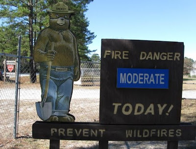
Yep, still friends Right off, friends tell friends their honest opinion, correct? Answer--"Y E S"! I do love Smokey the Bear too.
The picture must not come through correctly colorwise. It's a very champagne or buff looking color. I do know a little of my Summer/Air colors (I was told I was one and thought it too for 30 years-until CJW "corrected" me!). I have no idea on any other colors but, I can pretty well pick our Summer/Air:D:D:D
My question was/is, is the light tannish color too bland for a true Fire color?
No worries, Terri--still friends!
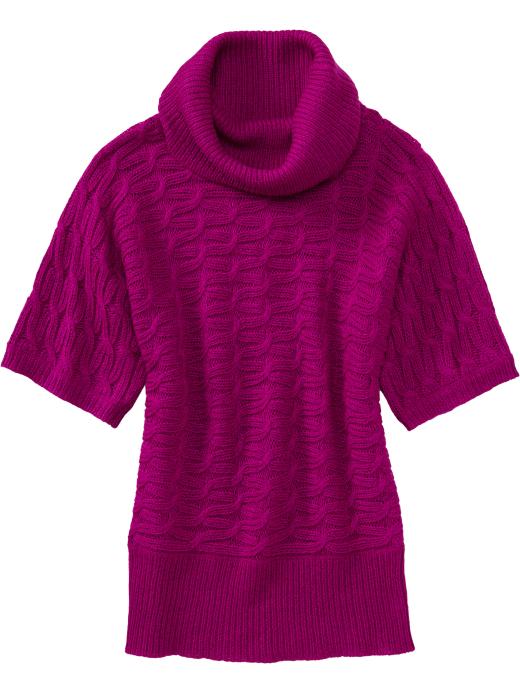
Kim,
Keep in mind there are light colors in the Fire palette, like a golden champagne. I uploaded a pic on post 63 of a sheath dress that is soft, champagne/oatmeal. It is a warm tone, not an oyster-white so it works for Fire. Bland? ....Maybe, when compared to the other fire colors. But like the superhero's faithful sidekick or the comedian's straight guy, it works but doesn't interfere. It lets the other colors speak louder and *charmingly agrees*. :p
In regards to the lavender tone of the jacket: Look how great the jacket looks against the beachy-gray weathered wood!! They totally belong. Like the raisin in the oatmeal cookie.
So that is why I questioned it as a fire color.
But in real life, does it have warm neutral or cool neutral tones? You, friend, are the expert.
The blue tops are giving me the blues! It could be my monitor is not 100% right, but I can say that if all 3 tops match up nicely and get along without something seeming "off", then they are indeed FIRE! I agreed that the Old Navy blue was Fire, so that is the control.
One more thing before I sign off for today: Do you receive the DHC skin care catalog? I received the print catalog today for Winter 2010 and on the cover is a gorgeous shot of a model who is totally FIRE with a stunning and simple apple green background. I got excited because I have not noticed too many fire cover models. I probably will now that I know I am fire! Like how I noticed how many Volkswagens there really are once I bought one!! If you do not have the print catalog, you can go to the dhccare dot com website and check out this month's customer spotlight. I pasted her picture here. Is she Fire or what?!

-
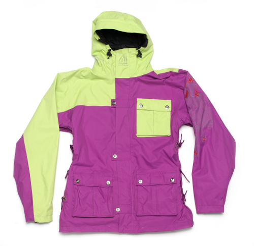
The jacket is from our St. Vincent De Paul thrift store that I volunteer at--cost $2. I don't think it's perfect but, for the cost it's usable.
We're friends, right? Good.
This jacket is a dusty lavender? If so, totally an AIR color. It will assert its airy-ness when paired with firey colors, so look out for possible wildfires when air and fire get together!! :p :D ;)
Still friends? ;)
-
The 2 outside pants are not hits but, I needed pants and they fit and looked nice on. I think I will make due with them until I can find better matches. I think they are neutral enough that with good Fire tops it will be OK. Sounds good! And way better than black pants!
I LOVE the camel pants. I hope I can find others like that color. I got them at CWC on clearance, of course :) Even Better!
Smiles :)
-
Here is the picture of all of the blue tops. Mixed in is the Old Navy long sleeved tee that you said was a "hit". Does this help any?
Also a pair of dressy shoes that I already have. Will they work now?
I am going to reply to this one first!
Here's the problem I am having with the blue tops. I THINK the blue top that is a cool tone is the one on the top by itself. Correct? If so, let's continue. The Old Navy long sleeve T is the one on the bottom, left. Somehow, the Old Navy top along with the short sleeve top both seem perfectly warm to me. But, and I fully admit, this is slight, the blue top on top is reading cool. Now that you have them all together, do me the favor of looking at them in sunlight. See if you can tell me if indeed that one looks a little "off" compared to the other ones. If it does, we can agree that it is cool toned, not warm. Then to confirm, hold the lone blue top against pure white paper and see if it looks cool next to cool.
(I hope Anita comments, too. please! :p)
Your shoes are so lovely! I wear a bronzy metallic shoe with a bright blue dress all the time now, to me that is a better choice than navy, black or camel with bright blue! In fact, this shoe color will probably work with most Fire colors, except brown. It may be better to pair up an outfit with that is brown dominant with a similar brown shoe.
-
Next up:
2 orange/red sweaters
2 skirts (short one is org/red multi and the longer 1 is bright violet/peachy and cream)
3 pairs of pants (1 pr is taupey/1 pr is camel/1 pr is coffee)
1 suit (it's called "peach punch" and it was originally $160 and I got it for $12.75)
This is all I'll post for a while to make sure I'm doing this right.
Lookin' good, Good Lookin'!
Love the orange-red sweaters, esp the sleeveless. How pretty!
The pants in the center are another perfect neutral camel. I have 2 pairs of pants in that color, one casual twill and one dressy wool-blend. I am going to wear them out!! The grayish ones I really can't comment because I have not found the elusive "warm gray" pants myself. That is a hard one for me. But the thing is, I think I've gotten to the point that I will know it when I see it, if I ever see it!!
Let us all know if you get reactions when you wear some of these new things...I bet $$$ you will!
-
One more thing, the cardigan you called "cinnamon" brown: That is a wonderful neutral, but it appears to be about the darkest brown for you. Don't go darker, toward an espresso, stay with the cinnamon. It makes a difference....:)
Of course, my comments are only my own opinion. I welcome anyone else's.......:D ;)
-
OK, here goes a try. It should be 4 tops--
They are: light bright yellow, yolk yellow short sleeve (not my choixce of names), aqua v-neck vest and a cinnamon brown cardigan. The last picture is of 2 blue tops.
Joby!
Did you have fun shopping?!;)
I am liking what I see here! Everything looks great - the only little nagging question I have is in the last picture of the 2 blue tops. Not quite sure -- but they look bright and cool to me. ... it could be just how the pic came out though....
Great job!:D
-
Fire dresses:
I have these dresses: (Coldwater Creek, online outlet, very limited sizes left.) This is very bright and pretty in person, unfortunately I ordered my usual size and it is about one size too small: is it me or the dress? LOL ;-P

Closeup of the print:

I also have this dress, again from Coldwater. It is indeed, a good Fire neutral that I wear with bright coral blazer, a brown blazer, a yellow cardigan or an orange fringe wrap.

I have this wrap and it works great with both dresses shown above. The color is Persimmon, and again from Coldwater (now available in the online Outlet):

Finally, I even have these shoes: Pretty, but NOT comfy. The azure is a great Fire aqua color if you don't like the idea of orange shoes!


-
Actually, I "think" these are the colors I bought--
bluest eye
plantain
lush green
I also got this shirt in "red stripe" http://oldnavy.gap.com/browse/product.do?cid=55404&vid=1&pid=792424&scid=792424032 LOOKS GREAT ONLINE!!
and I got this cardigan in "bright coral" http://oldnavy.gap.com/browse/product.do?searchCID=26519&vid=1&pid=771952&scid=771952042 LOOKS OK, but not perfect online. It looks like it Should be named: faded bright coral. Warm, but a little washed out. Not bad, though!!:p
Are these pretty close to our Fire colors?
Thanks for your help in getting my eye "trained" :)
You're welcome! I hope my opinion is helpful. Please let us all know how these colors work for you when you wear them..... dying to know!:p
-
Would that be the correct blue for Fires?
Here's a link that I think is the same as the t-shirt I bought-- http://oldnavy.gap.com/browse/product.do?cid=55405&vid=1&pid=771872&scid=771872122
Can you tell me if there are any other of the tees in our Fire colors?
Thanks for the tips
Kim
Hi Kim,
GREAT job with the blue t-shirt! That bright blue (color name: Bluest Eye) is PERFECT for Fire. If you are indeed Fire!! :D ;) Also great: Live Wire, Katies Kayak Blue, AND, surprise: Pink Stripe!
I am wearing the Pink Stripe long sleeve-T right now! I bought that as a welcome change of pace from typical solids. It is really, really difficult to find a stripe or print where all colors are ONE element, be it Fire, Ice, etc. In person, the Pink Stripe has a warm, soft oatmeal color between the bright stripes, so it works! The magenta stripe is Fire, the coral stripe is Fire, and the darkest stripe is kind of muted deeper fire with a touch of brown, if there is such a thing. I could make up a name like *cabernet* for it. So that deepest color is not perfect, but overall the Pink Stripe reads warm! And bright; brighter than it appears online.
Re: the other T-shirt colors. Online the Plum color looks like warm violet, but in person it didn't seem right. I pondered this color for a while, shopped at the men's side for my ICE husband, came back again, and it was just not 100% fire. Too much cool blue in it. Same deal with the Lush Green. It has definite cool green dominating, so I did not buy that either. I bought a yellow that is not shown online, and the Pink Stripe.
I bought this too!
http://oldnavy.gap.com/browse/product.do?cid=60792&vid=1&pid=792305&scid=792305042 in Razzmatazz!! It is definitely bright warm in person. It blends perfectly with the warm violet Color Intervention cards from CJW. I had this sweater draped on my car's front passenger seat (dark charcoal gray) and this color looked on fire with warmth!
CJW has me wearing all kinds of *loud* colors!!!:D;)
-
I dropped by Old Navy yesterday! Big sale, even on winter items. :D AND lots of bright colors, both those suitable for Ice and those for Fire! I got some inexpensive layering t-shirts and tanks for less than 5 dollars each. :)
It may be worth dropping by to look at the colors and train your eyes. A trick that helped me when shopping was to grab the very first Fire item I saw, one that I could confidently pick out as Fire, and carry it around as I sized up the other colors. Comparing the potential items to the Fire "control piece" was a good way to scrutinize the color value and temperature.
Good luck!:D
Now that I think of it, there were relatively few Earth items at Old Navy. Perhaps since they have a large base of young-ish buyers, they have more brighter colors. Just a thought! LOTS of black and gray, though!!
-
Miss Anita - Your comments are so astute, as always!
I agree that these two dresses appear Fire (left) and Ice (right).
Don't you think the models are backwards, though? Wouldn't they look better if they switched dresses?? :) :p
About the peacoat, I picked it up at a high-end consignment store. Yummy soft wool. I can't wait to wear it! I'll try to get an accurate picture of it - picture in your mind a magenta/fuschia/violet!! :p
I can't find an online pic of it - so allow me some leniency here and I will show you the closest match to the violet color I could find today while at work! BTW - this is a snowboarding jacket - pretty sweet!
-
These are all bright clear blue.
I LOVE these colors!
Thank you for posting, lately all I see in the stores is rack after rack of AIR / EARTH! With an occasional ICE red or green....;)
I found a really wonderful violet peacoat - the color is called Ultraviolet! It was one size too big, but I bought it anyway! :p
-
I just took a quick look and I think you have some good hits, but a couple of misses, too.
The Old Navy tank top in Lemon Pucker appears too cool, it looks like a lemon-lime color that is too cool.:(
The C&B absinthe green is too muted to be perfect Fire. It is a great Earth color, though. I have a Lands End top in that color and it looks good on me, but again it is not perfect. I like to wear that top with a colorful scarf that has fire tones of gold-yellow in it, to punch it up a little.
The driftwood knit jeans are just not right for Fire. Sorry.:(
The JCPenney sweater: yes! Looks great. :D
And the Coldwater Creek tops: nice choices!:)
-
Hi Terri,
thanks so much for the help! I'm not sure if it matters but the link I sent for the cardigan should have been the aquamarine NOT the cool blue.
The link for the blouse should have been for the iced mojito.
Are either of those colors better?
I'm disappointed on the brown, I thought for sure that was the correct one
Please continue to offer suggestions!
I am trying to help as best I can figger it all out!!:p Even though I feel I have come a long way, I still find it tough at times!!
OK, you mentioned you like the Iced Mojito blouse. I took a look, and it is definitely warm. But, 2 of the views are confusing me. In this view of the print, the colors look warm and muted (EARTH).

BUT in the view below, they look warm and brighter. :confused: So, this one is too tough for me to call it. :o :p If I had to make a call, I'd say it is more muted than a clear, warm FIRE. Now that I look again at the view below, I think the perfect Fire print would have a brighter golden color...... So now I am changing my tune and saying it is most likely too muted to be called the perfect Fire print.
Personally, I like it in this color, but I am committed to buying only what I need, love and am *sure* is right for Fire. I am *somewhat* shocked that I have not bought anything in black in more than a year! Even shoes! LOL

-

Hey Joby!
The image above is a closeup view of the Coldwater Creek skirt you linked to. Can you see that the brown has noticeable tones of purple in it? It also has an ashy gray to it. The above brown is a cool brown. Not right for FIRE...
Compare it to a closeup of another skirt on Coldwater Creek: the color shown below is called Acorn. It has a rusty orangey undertone. The skirt below is definitely warm compared to the skirt above. This is a much better choice for Fire and will complement bright warm tops much better. :) This Acorn color is pretty close to what I call Milk Chocolate Brown!! :) I've included the link to see a view of the whole skirt below.
Does this help you?
:D

-
What about these things from Coldwater Creek? Are they correct colors for Fire?
http://www.coldwatercreek.com/Products/Detail.aspx?productid=52807&ensembleid=58992 Yes, very nice!
http://www.coldwatercreek.com/Products/Detail.aspx?productid=47661&ensembleid=53732 Uhmm, not quite. The perfect brown is a warm brown the color of a milk chocolate bar, almost a rusty brown, but not muted. I know that's a tough one, but if you see it you will understand.
http://www.coldwatercreek.com/Products/Detail.aspx?productid=50913&ensembleid=57063 Nope. That is a cool blue. Try the Aquamarine. As long as it is bright in person, it would be great for FIRE!
http://www.coldwatercreek.com/Products/Detail.aspx?productid=52878&ensembleid=59020 Definitely not right for FIRE. The one called Sour Cherry is promising![ /quote]
Hope I have helped you!:D:D
-
I ordered some things from Penny's, Christopher & Banks and I think I'll try Coldwater Creek.
This is what I got from C&B--Am I on the right track with the colors?
http://www.christopherandbanks.com/product/index.jsp?productId=4031711&kw=4031711&sr=1&origkw=4031711 --$11.50/Clearly coral Looks great!
http://www.christopherandbanks.com/product/index.jsp?productId=4274703&cp=&kw=0034452982&origkw=+0034452982&sr=1 --$8.50/Precious gold Not perfect. Appears too muted.
http://www.christopherandbanks.com/product/index.jsp?productId=4031761&cp=&kw=0034311378&origkw=0034311378&sr=1 --$5.70/Province yellow Nice! Bright warm yellow!
http://www.christopherandbanks.com/product/index.jsp?productId=4031693&cp=&kw=0034414207&origkw=0034414207&sr=1 --$4.25/Pool blue Best choice so far! Perfecto!
http://www.christopherandbanks.com/product/index.jsp?productId=4152681&cp=&kw=0034438211&origkw=+0034438211&sr=1 --$7.45/Necklace Love it! I may order one for myself![/quote]
I hope they look as bright in person. That is something that happened with Chico's and Coldwater. Sometimes they appear brighter online than in person. Let us know when you get them! Awesome job bargain hunting!!:)


Stores that carry "FIRE" season clothing
in Cruise Fashions & Beauty
Posted
You'll find you cannot rely on color names at all!
The Deep Rose dresses on the J Crew links looked coral to me, too! I think they are so pretty!
:) :) :)