
Anita Latte
-
Posts
5,723 -
Joined
Content Type
Forums
Store
Blogs
Downloads
Events
Gallery
Posts posted by Anita Latte
-
-
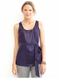
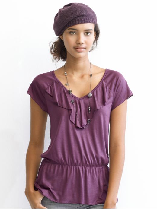
Check these out. The first one is definitely AIR. Depending on what the second one looked like IRL, it could be either AIR or EARTH. Both the first and second are muted. The other is clear, bright warm purple, FIRE.
-
Anita Latte,
if I saw either of these in the store, I'm not sure I would know that either were Fire. I would have called the dress Ice and it does look clear to me, and the shirt I would have called Air:eek:--it looks blended not clear.
Now on to your other post.
The dress IS ice. The shirt is fire though. Sometimes, the knit fabrics, which can be so dull (sweaters especially) can make identifying clear/muted more difficult.
-
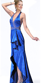
Juby, I hope you don't think that I have hy-jacked your thread here by doing what I am doing. I searched far and wide for an ICE blue. I was reduced to looking at evening gowns... I finally found one. The left blue is ICE and the right blue is FIRE. Anyway, in looking at the two blues above, perhaps you can see that both are clear blues, but the left blue is absolutely cold by comparison to the right blue. It's weird to think of blue as being "hot" or having any warmth... but it can...
It will take a while to train your eye. Comparison and making color families will really help. It's why having the big flop out color cards are helpful. Once your eye gets used to the idea, you can see if the color really "goes" or not. HTH!
-
When I was having my colors analyzed, Curt needed to me to find some true FIRE blues. He helped me to identify them by using the Express website, because he was familiar with the merchandise there. I'm basing these pictures on what I learned from Curt. These are from Express.
Basically, when you look at Fire colors, they almost hurt your eyes. It's ALMOST like you feel like you need sunglasses to keep on looking at the color. Fire is such a good terminology, because they really do look more "hot" than "cool". If you look at the top picture all by itself, you see that it is a blue color, but compared to the second picture, it almost looks greenish... but it is blue.
I think sometimes it is easier to see the comparisons, I'll see if I can find some Ice ones so that you can see the differences in the color parties. Your monitor may vary, but on mine, these are all Fire colors ranging through the blues and purples. If Curt has a free minute, maybe he could verify...


Stores that carry "FIRE" season clothing
in Cruise Fashions & Beauty
Posted
These are all bright clear blue. On my screen, the first two dresses are warm, FIRE blues and the left two dresses are cool, ICE blues. Whenever I find a royal ice blue, it always has a bit of a purple tinge to it when you hold it up to a warm blue.
Remember, doing this on the computer is really, REALLY hard. Different monitors see things differently. You might not see these as I am seeing them, which makes all of this very difficult...
One of the best tests for the royal blues is to hit the shoe department and match either gold or silver shoes. One will definitely look better... if it's the gold shoe, then it's warm, and if it's the silver shoe, then it's cool.